Visualization with Matplotlib
Matplotlib is a powerful Python library that provides many functions for graphically displaying data in the form of plots and charts. In this chapter, we will learn the basic functionality.
Getting Started
Similar to NumPy, we first need to install Matplotlib. In a Conda environment, this is done with the following command:
conda install -c conda-forge matplotlibThen we can import Matplotlib – specifically the submodule matplotlib.pyplot – into our program:
import matplotlib.pyplot as pltThe most important command is plt.plot(...). We can type plt.plot? to view its documentation.
In its simplest form, this function expects two vectors with the - and -coordinates of a point cloud. These vectors can be lists or NumPy arrays.
For example, we can plot the sine function as follows:
import numpy as np

x = np.linspace(0, 2*np.pi, 11)   # Create grid [0, 0.2*pi, 0.4*pi, ..., 2*pi]
y = np.sin(x)                     # Compute corresponding function values

plt.plot(x,y)                     # Create plot
plt.show()                        # Display the plot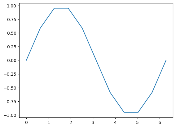
Here we also see a nice application of element-wise mathematical functions from numpy.
Styling Plots
Let’s make our plot a bit more attractive:
import numpy as np

x = np.linspace(0,4*np.pi, 1001) # Create an evenly spaced grid for the interval [0, 4*pi]
y = np.sin(x)                    # Compute corresponding function values for sine
z = np.cos(x)                    # and cosine

plt.figure(figsize=(10,5))       # Set figure size

plt.plot(x,y,label=r"$\sin(x)$")  # Create plot for sine
plt.plot(x,z,label=r"$\cos(x)$")  # Create plot for cosine

plt.title("Sine and Cosine")     # Plot title
plt.grid()                       # Turn on grid lines

plt.xlabel('x')                  # Label for x-axis
plt.ylabel('f(x)')               # Label for y-axis (in LaTeX code)

plt.legend()                     # Legend
plt.show()                       # Display the plot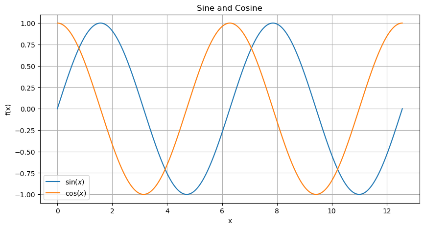
Basically, Matplotlib has drawn our point cloud with coordinates from x and y and connected the points with lines. However, there are many ways to customize the appearance of the lines and markers.
x = np.linspace(0,2,21)

y1 = x - 0.5*x**2
y2 = 2*x - x**2
y3 = 3*x - 1.5*x**2

plt.figure(figsize=(10,5))       # Set figure size

# Plot red (r) circles (o) with connecting lines (-)
plt.plot(x, y1, 'ro-', linewidth=0.2, label='f1')

# Plot blue (b) squares (s)
plt.plot(x, y2, 'bs', label='f2')

# Plot cyan (c) triangles (^) with dashed lines (--)
plt.plot(x, y3, 'c^--', markersize=10, label='f3')

plt.xlabel('x')
plt.ylabel('f(x)')
plt.grid()
plt.legend()
plt.show()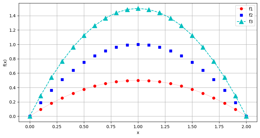
The string ‘ro-’ specifies color (r), marker (o), and line style (-).
The help text plt.plot? explains additional line and marker types. Predefined colors are available in the submodule matplotlib.colors. There are various color palettes. The basic colors are:
import matplotlib.colors as mcolors
mcolors.BASE_COLORS
{'b': (0, 0, 1),
'g': (0, 0.5, 0),
'r': (1, 0, 0),
'c': (0, 0.75, 0.75),
'm': (0.75, 0, 0.75),
'y': (0.75, 0.75, 0),
'k': (0, 0, 0),
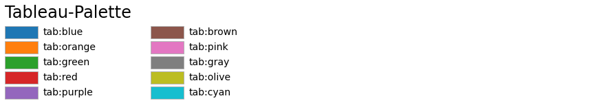
'w': (1, 1, 1)}In addition, there is the Tableau color palette, which is commonly used for charts:
mcolors.TABLEAU_COLORS{'tab:blue': '#1f77b4',
'tab:orange': '#ff7f0e',
'tab:green': '#2ca02c',
'tab:red': '#d62728',
'tab:purple': '#9467bd',
'tab:brown': '#8c564b',
'tab:pink': '#e377c2',
'tab:gray': '#7f7f7f',
'tab:olive': '#bcbd22',
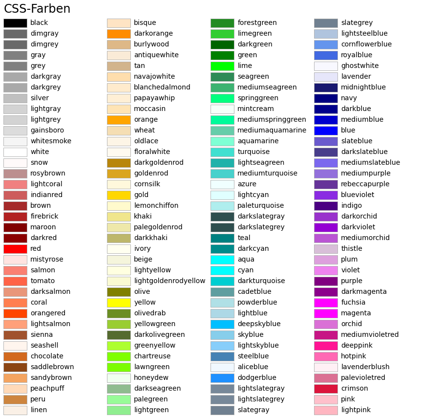
'tab:cyan': '#17becf'}In addition, many CSS colors are also available:
mcolors.CSS4_COLORS{'aliceblue': '#F0F8FF',
'antiquewhite': '#FAEBD7',
'aqua': '#00FFFF',
'aquamarine': '#7FFFD4',
'azure': '#F0FFFF',
'beige': '#F5F5DC',
'bisque': '#FFE4C4',
'black': '#000000',
'blanchedalmond': '#FFEBCD',
'blue': '#0000FF',
'blueviolet': '#8A2BE2',
'brown': '#A52A2A',
'burlywood': '#DEB887',
'cadetblue': '#5F9EA0',
'chartreuse': '#7FFF00',
'chocolate': '#D2691E',
'coral': '#FF7F50',
'cornflowerblue': '#6495ED',
'cornsilk': '#FFF8DC',
'crimson': '#DC143C',
'cyan': '#00FFFF',
'darkblue': '#00008B',
'darkcyan': '#008B8B',
'darkgoldenrod': '#B8860B',
'darkgray': '#A9A9A9',
'darkgreen': '#006400',
'darkgrey': '#A9A9A9',
'darkkhaki': '#BDB76B',
'darkmagenta': '#8B008B',
'darkolivegreen': '#556B2F',
'darkorange': '#FF8C00',
'darkorchid': '#9932CC',
'darkred': '#8B0000',
'darksalmon': '#E9967A',
'darkseagreen': '#8FBC8F',
'darkslateblue': '#483D8B',
'darkslategray': '#2F4F4F',
'darkslategrey': '#2F4F4F',
'darkturquoise': '#00CED1',
'darkviolet': '#9400D3',
'deeppink': '#FF1493',
'deepskyblue': '#00BFFF',
'dimgray': '#696969',
'dimgrey': '#696969',
'dodgerblue': '#1E90FF',
'firebrick': '#B22222',
'floralwhite': '#FFFAF0',
'forestgreen': '#228B22',
'fuchsia': '#FF00FF',
'gainsboro': '#DCDCDC',
'ghostwhite': '#F8F8FF',
'gold': '#FFD700',
'goldenrod': '#DAA520',
'gray': '#808080',
'green': '#008000',
'greenyellow': '#ADFF2F',
'grey': '#808080',
'honeydew': '#F0FFF0',
'hotpink': '#FF69B4',
'indianred': '#CD5C5C',
'indigo': '#4B0082',
'ivory': '#FFFFF0',
'khaki': '#F0E68C',
'lavender': '#E6E6FA',
'lavenderblush': '#FFF0F5',
'lawngreen': '#7CFC00',
'lemonchiffon': '#FFFACD',
'lightblue': '#ADD8E6',
'lightcoral': '#F08080',
'lightcyan': '#E0FFFF',
'lightgoldenrodyellow': '#FAFAD2',
'lightgray': '#D3D3D3',
'lightgreen': '#90EE90',
'lightgrey': '#D3D3D3',
'lightpink': '#FFB6C1',
'lightsalmon': '#FFA07A',
'lightseagreen': '#20B2AA',
'lightskyblue': '#87CEFA',
'lightslategray': '#778899',
'lightslategrey': '#778899',
'lightsteelblue': '#B0C4DE',
'lightyellow': '#FFFFE0',
'lime': '#00FF00',
'limegreen': '#32CD32',
'linen': '#FAF0E6',
'magenta': '#FF00FF',
'maroon': '#800000',
'mediumaquamarine': '#66CDAA',
'mediumblue': '#0000CD',
'mediumorchid': '#BA55D3',
'mediumpurple': '#9370DB',
'mediumseagreen': '#3CB371',
'mediumslateblue': '#7B68EE',
'mediumspringgreen': '#00FA9A',
'mediumturquoise': '#48D1CC',
'mediumvioletred': '#C71585',
'midnightblue': '#191970',
'mintcream': '#F5FFFA',
'mistyrose': '#FFE4E1',
'moccasin': '#FFE4B5',
'navajowhite': '#FFDEAD',
'navy': '#000080',
'oldlace': '#FDF5E6',
'olive': '#808000',
'olivedrab': '#6B8E23',
'orange': '#FFA500',
'orangered': '#FF4500',
'orchid': '#DA70D6',
'palegoldenrod': '#EEE8AA',
'palegreen': '#98FB98',
'paleturquoise': '#AFEEEE',
'palevioletred': '#DB7093',
'papayawhip': '#FFEFD5',
'peachpuff': '#FFDAB9',
'peru': '#CD853F',
'pink': '#FFC0CB',
'plum': '#DDA0DD',
'powderblue': '#B0E0E6',
'purple': '#800080',
'rebeccapurple': '#663399',
'red': '#FF0000',
'rosybrown': '#BC8F8F',
'royalblue': '#4169E1',
'saddlebrown': '#8B4513',
'salmon': '#FA8072',
'sandybrown': '#F4A460',
'seagreen': '#2E8B57',
'seashell': '#FFF5EE',
'sienna': '#A0522D',
'silver': '#C0C0C0',
'skyblue': '#87CEEB',
'slateblue': '#6A5ACD',
'slategray': '#708090',
'slategrey': '#708090',
'snow': '#FFFAFA',
'springgreen': '#00FF7F',
'steelblue': '#4682B4',
'tan': '#D2B48C',
'teal': '#008080',
'thistle': '#D8BFD8',
'tomato': '#FF6347',
'turquoise': '#40E0D0',
'violet': '#EE82EE',
'wheat': '#F5DEB3',
'white': '#FFFFFF',
'whitesmoke': '#F5F5F5',
'yellow': '#FFFF00',
'yellowgreen': '#9ACD32'}By setting the color parameter in the plot command, a color from one of these palettes can be selected:
x = np.linspace(0,1,10)

plt.plot(x,0.5*x*(1-x),'o-',color='g')         # Basic color
plt.plot(x,x*(1-x),'d-',color='tab:olive')     # Tableau color
plt.plot(x,1.5*x*(1-x),'s-',color='firebrick') # CSS color

plt.show()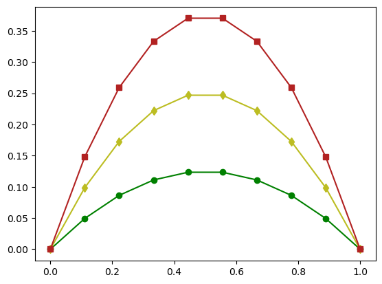
Colors can be specified either using short codes (
'r','g','b'), Tableau names ('tab:blue','tab:orange', ...), or CSS color names ('firebrick','gold','navy', ...).
The following table contains a complete list of all predefined colors:
Source
from matplotlib.patches import Rectangle
import matplotlib.pyplot as plt
import matplotlib.colors as mcolors


def plot_colortable(colors, title, sort_colors=True, emptycols=0):

    cell_width = 212
    cell_height = 22
    swatch_width = 48
    margin = 12
    topmargin = 40

    # Sort colors by hue, saturation, value and name.
    if sort_colors is True:
        by_hsv = sorted((tuple(mcolors.rgb_to_hsv(mcolors.to_rgb(color))),
                         name)
                        for name, color in colors.items())
        names = [name for hsv, name in by_hsv]
    else:
        names = list(colors)

    n = len(names)
    ncols = 4 - emptycols
    nrows = n // ncols + int(n % ncols > 0)

    width = cell_width * 4 + 2 * margin
    height = cell_height * nrows + margin + topmargin
    dpi = 72

    fig, ax = plt.subplots(figsize=(width / dpi, height / dpi), dpi=dpi)
    fig.subplots_adjust(margin/width, margin/height,
                        (width-margin)/width, (height-topmargin)/height)
    ax.set_xlim(0, cell_width * 4)
    ax.set_ylim(cell_height * (nrows-0.5), -cell_height/2.)
    ax.yaxis.set_visible(False)
    ax.xaxis.set_visible(False)
    ax.set_axis_off()
    ax.set_title(title, fontsize=24, loc="left", pad=10)

    for i, name in enumerate(names):
        row = i % nrows
        col = i // nrows
        y = row * cell_height

        swatch_start_x = cell_width * col
        text_pos_x = cell_width * col + swatch_width + 7

        ax.text(text_pos_x, y, name, fontsize=14,
                horizontalalignment='left',
                verticalalignment='center')

        ax.add_patch(
            Rectangle(xy=(swatch_start_x, y-9), width=swatch_width,
                      height=18, facecolor=colors[name], edgecolor='0.7')
        )

    return fig

plot_colortable(mcolors.BASE_COLORS, "Grundfarben",
                sort_colors=False, emptycols=1)
plot_colortable(mcolors.TABLEAU_COLORS, "Tableau-Palette",
                sort_colors=False, emptycols=2)

plot_colortable(mcolors.CSS4_COLORS, "CSS-Farben")

# Optionally plot the XKCD colors (Caution: will produce large figure)
# xkcd_fig = plot_colortable(mcolors.XKCD_COLORS, "XKCD Colors")
# xkcd_fig.savefig("XKCD_Colors.png")

plt.show()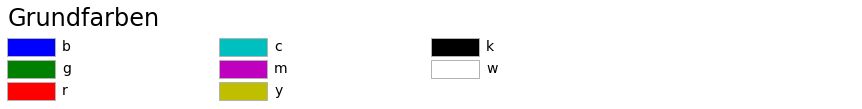
In error analysis, logarithmic axes are often of interest.
Suppose we analyze an iterative algorithm and measure the error between the exact solution and the computed approximation after iterations.
A method is said to converge
Q-linearly, if
Q-superlinearly, if
with a sequence
Q-quadratically, if
Let us visualize the error progression once in a standard Cartesian coordinate system and once in a coordinate system with a logarithmic -axis:
import math

n = np.array(range(1,6), dtype='float64')
err_p1 = (0.8)**n
err_p2 = [1./math.factorial(int(i)) for i in n]
err_p3 = (0.8)**(2**n)

plt.figure(figsize=(10,5))

def generate_plot():
    plt.plot(n, err_p1, 'ro-', label='Q-linear')
    plt.plot(n, err_p2, 'bo-', label='Q-superlinear')
    plt.plot(n, err_p3, 'co-', label='Q-quadratic')
    plt.grid()

# Plot in Cartesian coordinate system
plt.subplot(1,2,1)
generate_plot()
plt.legend(loc='upper right')

# Plot with logarithmic y-axis
plt.subplot(1,2,2)
generate_plot()
plt.semilogy()
plt.legend(loc='lower left')

plt.show()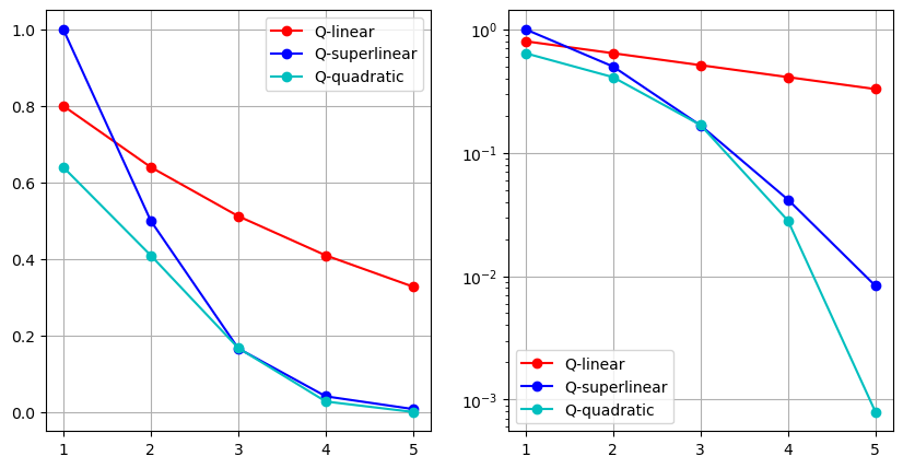
We observe that a Q-linearly convergent sequence appears as a linear function in a plot with a logarithmic -axis.
Similarly, the -axis can also be scaled logarithmically using plt.semilogx().
However, for the application considered above, this is not very useful.
Bar, Stem, and Pie Charts
Let us look at some additional basic plot types. Suppose we have the results of a survey and want to visualize them graphically. Our sample data is:
transport = ["Car", "Bicycle", "Bus", "Train", "On Foot", "Other"]
colors = ["gray", "green", "blue", "red", "orange", "purple"]

values = [35, 28, 12, 10, 11]
values.append(100 - sum(values))
Instead of the command plt.plot, other plot types can also be used:
stem– stem plotscatter– scatter plotbar– bar chartpie– pie chart
In the following example, these visualization types are compared:
plt.figure(figsize=(10,10))

plt.subplot(2,2,1)
plt.stem(transport, values)
plt.title("Plot")

plt.subplot(2,2,2)
plt.bar(transport, values, color=colors)
plt.title("Bar")

plt.subplot(2,2,3)
plt.scatter(transport, values, color=colors)
plt.title("Scatter")

plt.subplot(2,2,4)
plt.pie(values, labels=transport, explode=[0,0.2,0,0,0,0], colors=colors, autopct='%1.1f%%')
plt.title("Pie")

plt.show()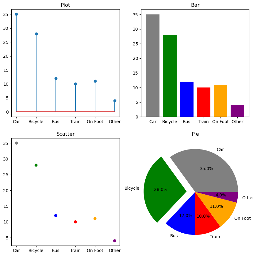
Plots for Scalar and Vector Fields
For the graphical representation of scalar fields and vector fields , Matplotlib provides various functions.
Many visualizations of scalar fields expect three matrices as arguments: one for the -coordinates, one for the -coordinates, and one for the function values .
The function numpy.meshgrid is useful here, as it allows us to generate a two-dimensional tensor-product grid from two one-dimensional grids.
# 1D grids for x- and y-variables
x = np.linspace(-5,5,1001)
y = np.linspace(-4,4,1001)

# Generate 2D grid
X, Y = np.meshgrid(x, y)

# Define Himmelblau function
Z = (X**2 + Y - 11)**2 + (X + Y**2 - 7)**2
Contour Plots:
One possible way to visualize such a scalar field is a contour plot. Here, the curves
are drawn for various values :
plt.contour(X,Y,Z, levels=25)
plt.colorbar()
plt.show()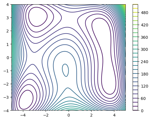
Colormap Plots:
Another option is a color plot, where the function value at a point is represented using a color scale:
import matplotlib.cm as cm

plt.pcolormesh(X,Y,Z, cmap=cm.coolwarm)
plt.show()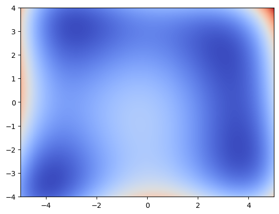
3D Representations of Scalar Fields:
Scalar fields can also be visualized in a three-dimensional coordinate system. Here, the arguments are plotted on the - and -axes, and the function value on the -axis. First, we need to create a 3D coordinate system. We do this by creating a new figure via
fig = plt.figure()and adding a 3D subplot:
ax = fig.add_subplot(projection='3d')ax then provides the corresponding plot commands. Here is an example:
fig = plt.figure(figsize=(8,6))

# Surface-Plot
ax1 = fig.add_subplot(1,2,1, projection='3d')
ax1.plot_surface(X,Y,Z, cmap=cm.inferno)
ax1.set_title("Surface-Plot")

# Wireframe-Plot
ax2 = fig.add_subplot(1,2,2, projection='3d')
ax2.plot_wireframe(X, Y, Z, rcount=20, ccount=20)
ax2.set_title("Wireframe-Plot")

plt.show()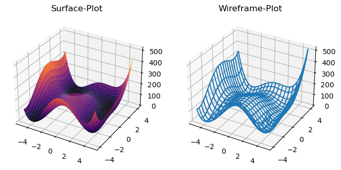
Plots for Vector Fields:
Vector fields can be visualized in Matplotlib using quiver plots. In a quiver plot, the function value is represented by an arrow starting at the point .
Example: The vector field
can be displayed on a regular grid. Optionally, the arrows can be colored according to their length.
x = np.linspace(-1,1, 11)
y = np.linspace(-1,1, 11)

# Define point grid
X, Y = np.meshgrid(x, y)

# Function values of F
Z1 = -Y
Z2 = X

# Optional: color arrows by magnitude
C = np.sqrt(Z1**2 + Z2**2)

# Create and display quiver plot
plt.quiver(X, Y, Z1, Z2, C, cmap=cm.rainbow)
plt.show()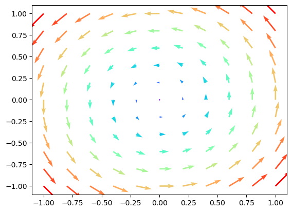
Plots for Curves
Curves can also be drawn in Matplotlib. A curve is initially a set of points
with a so-called curve parametrization , which is assumed to be regular, i.e., for all .
Curves in the plane:
For a planar curve (), we can use the normal plot command. For example, the cloverleaf curve
can be plotted with:
t = np.linspace(0,2*np.pi,100)
x = np.cos(t)+np.cos(2*t)
y = np.sin(t)-np.sin(2*t)

plt.plot(x,y,'o-')
plt.grid()
plt.show()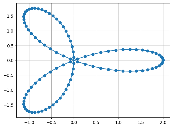
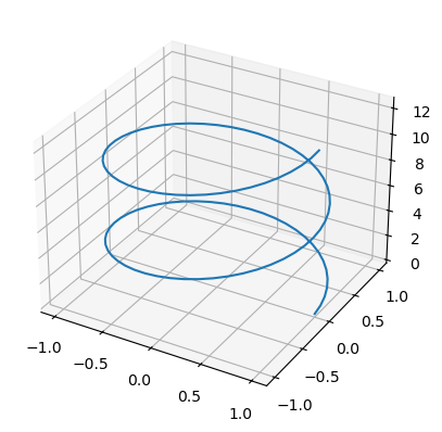
Curves in space:
Similarly, space curves () can be plotted, but a three-dimensional coordinate system must be created first. We have already seen how to set this up. Here, we plot the helix
t = np.linspace(0,4*np.pi,100)
x = np.cos(t)
y = np.sin(t)
z = t

fig = plt.figure()

ax = fig.add_subplot(projection='3d')
ax.plot3D(x, y, z)

plt.show()