Responsive Design
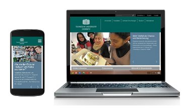
The content of the TU Chemnitz websites should be easily readable on all display devices - on smartphones, tablets, desktops, TVs, also on high-resolution screens, for visually impaired people and printed on paper. To achieve this, web authors need to follow aspects of responsiv webdesign, that way the content adapts to the available resolution of the end device.
The layout system used, TUCAL, already adjusts the frame of the web pages accordingly - if you reduce your browser window, you will see the effect. As a web author, you must follow a few instructions regarding the content in order to make your web pages look good everywhere.
The space is limited in width: On desktops, the content is a maximum of 827 pixels, on smartphones a minimum of 320 pixels. (Cover images are a maximum of 855 pixels wide, as they have no lateral spacing). A few tips can be derived from this:
-
Images: Reduce image files so that they are a maximum of 827 pixels wide (or smaller if you do not want it to take up the entire width).
For each image use the class
img-responsive:<imgsrc="image_file.jpg"class="img-responsive"/>
Thus, the image will take up the maximum available area until it reaches 100% scaling. -
HTML-Table:
<table>elements should be avoided as far as possible, especially those with many wide columns. The columns are always displayed side by side, even on smartphones - where you then have to scroll sideways.
For more information about tables and how you can still design content aligned in columns, see the section Grid-System. -
Self-defined widths should not be defined absolutely in pixels but as a percentage relative to the parent element.
Minimum or maximum widths can be declared
min-width/max-width.
Example:<divstyle="width:30%;max-width:300px">…</div>
Recommendation: Use the Bootstrap-Grid-System . -
Long words cannot be fully displayed on smaller screens and lead to display errors.
With the special character
­a break can be inserted. If necessary, the word is separated at this point with a hyphen, otherwise the character is visible. From approx. 20 characters per word, this character should be set, especially in the menu. A break without a hyphen is made possible by this character:​IncomprehensibilitiesIn&shy;com&shy;pre&shy;hensi&shy;bil&shy;ities
Grid
The Grid-System from Bootstrap enables a simple and manageable presentation of content. Its layout is similar to that of tables. However, it is much more flexible and accordingly adapts better to a responsive web design.
The change of the display happens step by step. (For the university website, these steps were customised in Bootstrap and an additional step was added).
An overview of these steps
Functionality
<div class="col-xm-6 col-md-4">Content</div>- Assigning the width of the element via classes
- The width is relative to the parent element.
- Multiple classes can specify different widths for different sized displays.
- Grid consisting of 12 columns
- Suffix of the class indicates the width in number of columns.
"col-xm-6"results in a width of: 6/12 = 50%
- If the display width falls below the ranges defined by the classes, the element is displayed with automatic width.
- For block elements (e. g.
<div />), the automatic width is 100%. - For inline elements (e. g.
<span />), the width is defined by the content. - The other formatting by
"col-xm-6"remains active below 550px.
- For block elements (e. g.
Simple Application
Basically, it is enough to work with the size "m". Thus, the display on desktops and tablets remains the same, only on smartphones the columns with the content are displayed one below the other. This way, they are easily to view on small devices.
From a width of 800px the side menu is displayed next to the content, so the available width is almost identical to the mobile view from 550px.
<div class="row">
  <div class="col-xm-6">Lorem ipsum …</div>
  <div class="col-xm-6">Lorem ipsum …</div>
</div>
Notes
"row"expands the overlying element right and left by 14px each."col-xm-6"has a padding of 14px on the left and right. This separates columns by 28px, which is visually appealing.- More examples
Media Queries
CSS styles can be restricted to specific media types, display sizes, and orientations through media queries. Media queries also underlie the Bootstrap Framework.
A description of the specification can be found on w3schools.com.
The media type all is the default value and can also be omitted.
The CSS code required for this must either be loaded via a CSS file or added to the frame variable $css_in .
$css_in = '@media (min-width: 550px) {
  .page-content table { background-color: #e6e6e6; }
}';
Tables
If you can't work without tables after all, there are two ways to stick to responsive web design anyway.
-
There are cases where the use of a normal table is still the better choice. This is the case, for example, when the content remains comprehensible only through its presentation in table form or when summary cells are needed. However, this must then be enclosed in a
divelement, which contains the classclass="table-responsive". Thus, you only have to scroll the table if the width is not enough.02.07.2015 15:30 Reichenhainer Str. 70, Rühlmann-Bau, 2/70/B202 Big Data: Mathematical methods and applied problems
The aim of the workshop is to bring together mathematicians and scientists working in fields where mathematical expertise can bring significant profit to applications. More ... …09.07.2015 16:30 Reichenhainer Str. 35/37, Student Residence, Meadow in front of student club Barbecue of the Faculty of Mathematics
More ... …16.07.2015 11:30 Reichenhainer Str. 39, 638 E-Learning Lunch
Franziska Nestler, Daniel Potts
For the students of mechanical engineering, our faculty will offer an internship in the coming semester in addition to the lectures and exercises. Here we want to present and discuss the concept.<div class="table-responsive"> <table class="zeile"> … </table> </div> -
If the dynamic adaptation of the cell size to its content is required for certain display size layouts, there are again two possibilities for implementation.
-
divelements with CSS propertiesdisplay:tableconvert to a table: This property can also be defined via media queries only for certain display sizes.
You will find a detailed description with examples on w3schools.com. -
Conversely, table cells can also be converted into block elements such as
divwith the help of CSS. With the class"zeile-xs"this is done for a width of less than 550px. The columns are arranged one below the other from left to right.02.07.2015 15:30 Reichenhainer Str. 70, Rühlmann-Bau, 2/70/B202 Big Data: Mathematical methods and applied problems
The aim of the workshop is to bring together mathematicians and scientists working in fields where mathematical expertise can bring significant profit to applications. More ... …09.07.2015 16:30 Reichenhainer Str. 35/37, Studentenwohnheim, Wiese vorm Studentenclub Barbecue of the Faculty of Mathematics
More ... …16.07.2015 11:30 Reichenhainer Str. 39, 638 E-Learning Lunch
Franziska Nestler, Daniel Potts
For the students of mechanical engineering, our faculty will offer an internship in the coming semester in addition to the lectures and exercises. Here we want to present and discuss the concept.<table class="zeile zeile-xs"> … </table>
-