
Tips for Accessible Web Design
Website content is often difficult or incomplete to access for people with disabilities. When creating websites, special requirements must therefore be respected when creating websites in order to reduce these barriers. This includes, for example, adhering to certain contrast values and designing the code of the pages in such a way that it can be interpreted with the help of special software (screenreader) for non-visual output, such as speech or the Braille display. The accessibility of web pages is improved by considering the following tips.- Document Title
- Structures
- Link Texts
- Alternative Texts
- Contrasts and Colours
- Multimedia
- Instructions
- Comprehensibility
- Checklists
Document Title
Every web page needs a short, content-related and unique document title. The title of a page can be identical to the main content heading. The content reference should be at the beginning of the title (e. g. before information on the rubric or organisational unit.). For pages that are part of a multi-step process, the current step should be part of the title.
Currently, the document titles are generated from the navigation information $nav[] and the page name from $menu[] in the config.inc.
In the config.inc of the URZ user account page the following details have been specified:
$nav['URZ']='/urz/';
…
$menu[]=array('name' => 'Allgemeines', 'url' => 'index.html', 'level'=> '1');
$menu[]=array('name' => 'Nutzerkonto', 'url' => 'nutzerkonto.html', 'level'=> '2');Sometimes the document titles become very long as a result of this form of generation, e. g.:
App- und Gerätepasswörter | Identitätsmanagement | Dienste | URZ | TU Chemnitz
A shorter but still meaningful title can be entered at the beginning of the HTML page in the function seite() as the second argument:
<?php
require_once('config.inc');
seite(__FILE__, 'App- und Gerätepasswörter | URZ');
?>
App- und Gerätepasswörter | URZ | TU Chemnitz is now displayed as the document title. "TU Chemnitz" is always added automatically and does not have to be specified.
Further information on accessibility:
Structures
Headings should be used to convey the meaning and structure of a piece of content. Paragraphs should be grouped with a heading and the heading text should describe the subsequent content concisely but clearly. If only the heading text were read, it should be possible to follow the structure of the content.
<h1>Notes on corporate design for websites</h1>
<p>Introductory text to the topic ...</p>
<h2>Implementation</h2>
<p>A few general notes on implementation - individual variants described in more detail follow.</p>
<h3>Simple HTML frame</h3>
<h3>HTML frame for PHP / TWIG</h3>
<h3>TUC template for Django</h3>
In addition to heading elements also paragraphs, lists and data tables must be prepared semantically correct. Basically, all content belongs either in a paragraph (<p>), one of the elements for lists (<li>, <dt>, <dd>) or in a data cell (<td>).
Empty paragraphs should be avoided. Paragraphs should also not be separated by line breaks. For <br /> there are only a few use cases, these include, for example, poems or breaks in addresses.
<div>-elements are used for layout purposes only and have no meaning for screen readers.
Further information on accessibility:
Link Texts
Link texts should always be meaningful and describe the link purpose. Ambiguous link texts such as "more" or "here" should be avoided. Relevant information about link targets such as format or size of a file should also be included in the link text.
<a href="URZ__house_rules.pdf">Regulations for the use of the University Computer Centre (PDF)</a>You can find more information on the design of print media and websites of the TU Chemnitz
at <a href="/tu/pressestelle/cd/handbuch.html">Corporate Design Handbook</a>
on the website of the Press Office and Crossmedia Communications team.Further information on accessibility:
Alternative Text
Graphics need significant text alternatives. Each graphic should have an alternative text that conveys the content or function of the graphic. Purely decorative graphics, on the other hand, should have an empty alternative text.
<img src="mobileSites.jpg"
     class="img-responsive"
     alt="Photo of a smartphone with the TU mobile website"
     src="mobileSites.jpg">
<img src="mobileSites.jpg"
     class="img-responsive"
     alt="In the photo, two hands present the mobile view of the TU website on the smartphone."
     src="mobileSites.jpg">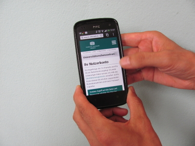
Further information on accessibility:
Contrast and Colours
For the readability and perceptibility of texts, there must be a sufficient contrast between the text colour and the background. The contrast ratio should be at least 4.5:1 (conformity level AA). To calculate and try out the contrast ratio, we recommend using the Color Contrast Checker from WebAIM.
Critical colour combinations, such as red on green or black, should be avoided, as they are not easily perceived by people with visual impairments.
<p style="color:#45D9BE;background-color:#fff">
  Contrast ratio 1,76:1 – far too low </p>
<p style="color:#23A991;background-color:#fff">
  Contrast ratio 2,93:1 – too low </p>
<p style="color:#177665;background-color:#fff">
  Contrast ratio 5,50:1 – sufficient for AA</p>
<p style="color:#146154;background-color:#fff">
  Contrast ratio 7,32:1 – sufficient for AAA</p>
Contrast ratio 1,76:1 – far too low
Contrast ratio 2,93:1 – too low
Contrast ratio 5,50:1 – sufficient for AA
Contrast ratio 7,32:1 – sufficient for AAA
Further information on accessibility:
Multimedia
Audio and video content require text equivalents. For pure audio content (e. g. podcast) text transcripts are necessary. Spoken content and important sounds relevant to understanding the content should be provided in the text transcripts and subtitles.
For video sequences, (acoustic or textual) descriptions of the visual content that are important for understanding and cannot be perceived acoustically should be considered.
Further information on accessibility:
Instructions
Instructions must be clear. Instructions, explanations and error messages should be understandable and jargon should be avoided. For example, write "The input is too long, a maximum of 200 characters is allowed" instead of "Please correct your input". Permitted value ranges (e. g. format for date entry) should be made available in prompts.
<label for="startdate">Start (yy/mm/dd)</label>
<input name="sdate" id="startdate" type="date">
It is common to mark mandatory fields with an asterisk (*). If you use this variant, do not forget to point out the meaning on your page: "Fields with an * are mandatory fields". Mandatory or optional fields can alternatively be marked with a corresponding text in the label.
<label for="fname">First name (Mandatory Field): </label>
<input name="firstname" id="fname" type="text"><label for="fname">First name (Mandatory Field):
<input name="firstname" id="fname" type="text">
</label>Mandatory fields can also be highlighted especially for screen readers by using ARIA attributes:
<label for="fname">First name</label>
<input aria-required="true" name="firstname" id="fname" type="text">
Further information on accessibility:
Comprehensibility
Content must be clear and concise. Comprehensible language and appropriate, supportive comprehensible formatting should be used:
Write short and clear sentences and paragraphs.
Avoid unnecessarily complex terms and phrases. Terms and phrases that might be unfamiliar to users should be explained, for example, in a glossary.
Explain acronyms the first time they are used, e. g. "Technical University (TU)".
Structure and organise your content through appropriate formatting, e. g. as lists or headings.
If the meaning of a content might be unclear, check whether the use of additional pictures, illustrations, audio or symbols makes the content easier to understand.
Further information on accessibility: